Cluster Analysis of Simulated Eye-Tracking Data
What is Cluster Analysis?
Cluster analysis is a grouping technique that aims to put in the same group (or cluster) objects that are more similar to each other. The intent is very similar to what our brain does when we try to recognise a pattern and group elements based on similarity.
How many clusters does your brain work out to group these tiles?

If you ask your flatmate or your coworker, it is possible that they will provide a completely different answer. Similarly, you can use different algorithms to work out the number of clusters that better fits your data, however, different algorithms may provide different answers.
An example of a field of application of cluster analysis is spatial clustering, or grouping data points based on their location in space. This might sound like a trivial task if you are considering data that is well segregated in space, but it might become challenging if data is highly packed and densely occupies the space.
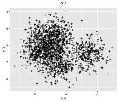
This is often the case of eye-tracking data - the traces of someone’s gaze on a screen as recorded by an eye-tracker. Gaze is quick and volatile, and people tend to look away and back a lot in short periods of time, therefore, gaze data often look extremely chaotic. Here is an example of gaze data from several people in approximately 20 seconds:
![]()
To make sense of this mess, scientist often work out clusters that are predefined.
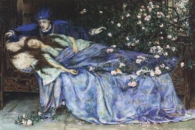
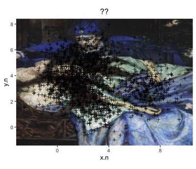
For example, if gaze data has been recorded while people were looking at the painting ‘Sleeping Beauty’ by Henry Meynell Rheam, it may be reasonable to cluster the gaze data based on the main elements of the painting - the blooming tree on the right, the sleeping beauty at the centre, the prince charming on the top half, and the background (floor and background elements of the room).
The assumption is that most people tend to look at the most salient features of the picture, and that the gaze that falls within a certain area (termed Area of Interest) is meant to explore and process the individual element/s present in that area. This assumption is partly based on the physiology of the eye, that possesses the most sensitive receptors in one tiny area only, the macula, and need to move around to ensure a high resolution reconstruction of one individual element.
However, assuming that the same rules work for everyone always comes at a cost. Most people is not every person: some people may actually explore prince charming as part of the background, who knows? Drawing a boundary between prince charming and the background may introduce a bias in the analysis. Also, choosing the level of granularity of the Areas of Interest may reflect the researchers' sensitiveness, for example, a highly analytic observer may decide to break down the sleeping beauty into smaller Areas of Interest, such as her head, hair, trunk, arms, while a holistic one may draw just one. Sometimes, researchers may even have a look at the data, and draw the Areas of Interest around the features that people look at the most - but that’s cheating.
Applying Cluster Analysis is a way of correcting some of the subjectivity embedded in grouping gaze data into Areas of Interest. It may not always be applicable, or make sense, and it does not avoid subjectivity completely. If you have drawn your Areas of Interest, it may be interesting to compare them with data-driven clusters detected by an algorithm.
In the following paragraph, we will apply different clustering algorithms to simulated (fake) eye-tracking data.
Generate the data
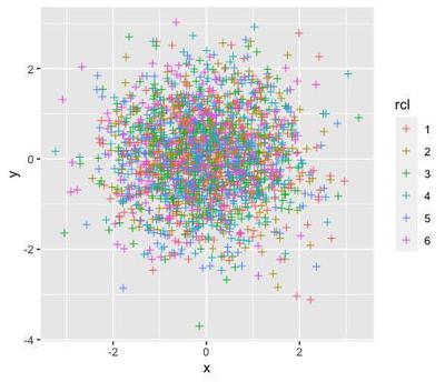
Let’s generate 2000 random points with normal distribution. In order to simulate clusters in the random data, I will shift the value of each point to one of 6 attractors (the variable rcl).
set.seed(0)
d <- data.frame(x=(rnorm(n = 2000)),
                y=rnorm(n=2000),
                rcl=factor(sample(1:6, 2000, replace=TRUE)))
knitr::kable(head(d))
| x | y | rcl |
|---|---|---|
| 1.2629543 | 0.4443458 | 3 |
| -0.3262334 | 0.0119294 | 6 |
| 1.3297993 | -0.0092800 | 1 |
| 1.2724293 | -0.3023776 | 2 |
| 0.4146414 | 0.4923550 | 6 |
| -1.5399500 | -0.6027196 | 5 |
This is how the randomly generated data looks like:
library(ggplot2)
ggplot2::ggplot(data=d, aes(x=x, y=y, col=rcl)) +
  geom_point(shape=3)
Artificially structure the data into clusters
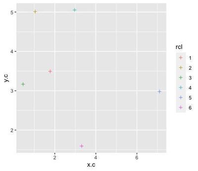
The attractors are 6 points randomly assigned to x and y coordinates:
rp <- data.frame(x.c=abs(rnorm(1:6, sd=4)),
                 y.c=abs(rnorm(6, sd=4)),
                 rcl=factor(sample(1:6, replace=FALSE)))
ggplot(data=rp, aes(x=x.c, y=y.c, col=rcl)) +
  geom_point(shape=3)
So we can just artificially structure the data around these attractors by dragging random points closer to one of them:
library(dplyr)
dc <- d %>%
  left_join(rp, by="rcl") %>%
  mutate(x.n=x+(x.c),
         y.n=y+(y.c)) %>%
  dplyr::select(rcl, x.n, y.n)
ggplot(data=dc, aes(x=x.n, y=y.n, col=rcl)) +
  geom_point(shape=3)
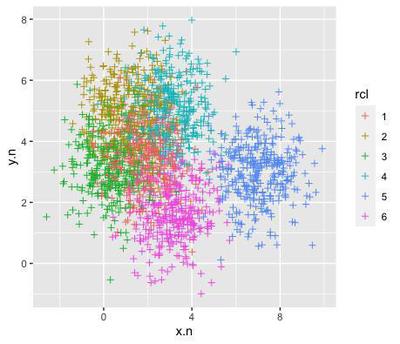
if we remove the colour labels, the data looks very much like the chaotic, densely packed data that you may obtain from an eye-tracking experiment:
ggplot(data=dc, aes(x=x.n, y=y.n)) +
  geom_point(shape=3) +
  labs(title="??") +
  theme(plot.title = element_text(hjust = 0.5))
that could be super-imposed on the sleeping beauty painting:
library(grid)
image <- jpeg::readJPEG("Henry_Meynell_Rheam_-_Sleeping_Beauty copy.jpg")
ggplot(data=dc, aes(x=x.n, y=y.n)) +
  labs(title="??") +
  theme(plot.title = element_text(hjust = 0.5)) +
  annotation_custom(rasterGrob(image, width = unit(1,"npc"), height = unit(1,"npc")), -Inf, Inf, -Inf, Inf) +
  geom_point(shape=3) +
  coord_fixed()
The following clustering methods will allow to estimate a number of clusters in the simulated data, that could be later used as Areas of Interest.
K-means Clustering Method
K-means is an unsupervised clustering method. It uses an algorithm that creates clusters with minimum internal variance, measured as the within-cluster sum of squares.
The algorithm repeats itself and assigns each data point to the cluster whose mean has the least squared (nearest) mean, and calculates the mean of the updated cluster (termed centroid). The algorithm converges and quits when the allocation of data points does not change anymore when updating the cluster mean. To apply this algorithm, it is necessary to set a predefined number of clusters.
The Elbow Test
To estimate the best number of clusters to feed to the K-mean algorithm, the elbow test calculates a measure of the error estimate (the sum of squared error) for a predefined number of clusters (for example, up to 10). Since increasing the clusters to infinite reduces the sum of squared error to 0, we are looking for the number of clusters that gives the minimum SSE before saturation.
# Determine number of clusters
dc.b <- dc[,-1]
dc.b
wss <- (nrow(dc.b)-1)*sum(apply(dc.b,2,var))

for (i in 2:10) wss[i] <- sum(kmeans(dc.b,
   centers=i)$withinss)

ggplot(data=data.frame(Clusters=as.factor(10:1),
                       SEE=sort(wss, decreasing = FALSE),
                       group=1),
       aes(x=Clusters, y=SEE, group=group)) +
  geom_point() +
  geom_line()
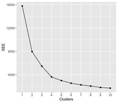
The elbow of the test corresponds to the node where the sum of squared error starts to plateau - here from 4 clusters on - meaning that, when we subdivide the data in more than 3 clusters, we do not gain anymore in terms of error. Therefore, we are going to select 3 clusters for the next steps. You may notice that this number does not reflect the initial number of attractors that we seeded in the data.
# K-Means Cluster Analysis
fit <- kmeans(dc.b, 3) # 3 cluster solution
# get cluster means
knitr::kable(aggregate(dc.b,by=list(fit$cluster),FUN=mean))
| Group.1 | x.n | y.n |
|---|---|---|
| 1 | 1.676188 | 4.819651 |
| 2 | 2.081512 | 2.226081 |
| 3 | 6.733131 | 2.996920 |
# append cluster assignment
cl.d <- data.frame(dc.b, fit$cluster)
knitr::kable(head(cl.d))
| x.n | y.n | fit.cluster |
|---|---|---|
| 1.718316 | 3.612103 | 1 |
| 2.981136 | 1.606597 | 2 |
| 3.104668 | 3.483643 | 2 |
| 2.317243 | 4.709362 | 1 |
| 3.722011 | 2.087022 | 2 |
| 5.560002 | 2.377491 | 3 |
The algorithm assigned each of the data points to 1 of the 3 clusters that they are more likely to pertain to.
ggplot(data=cl.d, aes(x=x.n, y=y.n, col=as.factor(fit.cluster))) +
labs(title="K-means", col="Cluster") +
  theme(plot.title = element_text(hjust = 0.5)) +
  annotation_custom(rasterGrob(image, width = unit(1,"npc"), height = unit(1,"npc")), -Inf, Inf, -Inf, Inf) +
  geom_point(shape=3) +
  coord_fixed()
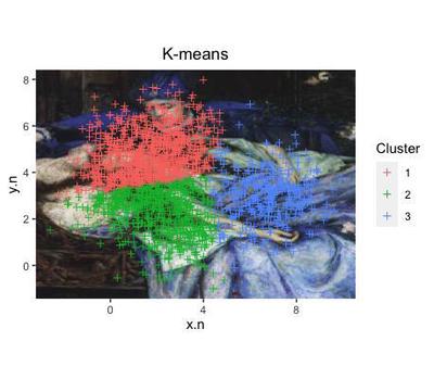
Note that the clusters found in the data with this algorithm do not correspond to the initial subdivision that we know to be true around the 6 artificial attractors.
K-Medoids
Using a different method will give even more different clusters?
The method Partitioning around Medoids selects a k number of medoids or cluster centers - very similar to the attractors that we artificially created at the beginning.
The data points are assigned to closest cluster, and the sum of the distance of a data point from the medoid or cluster center is calculated. The operation is repeated by swapping which medoids each point is assigned to, calculating a new sum of distance and subtracting it from the previous distance estimate. If the obtained difference is > 0, the swap is reverted. The algorithm converges when all the differences equal to 0. For this method, there is no need to predefine the number of clusters - althought the function will take a little more time to run compareed to K-means.
We obtain yet different data points to each cluster.
library(fpc)
library(cluster)
pamk.best <- pamk(dc.b)
med <- pamk.best$pamobject$medoids
cl.pam <- data.frame(dc.b, pam.cluster=pamk.best$pamobject$clustering)
knitr::kable(head(cl.pam))
| x.n | y.n | pam.cluster |
|---|---|---|
| 1.718316 | 3.612103 | 1 |
| 2.981136 | 1.606597 | 1 |
| 3.104668 | 3.483643 | 1 |
| 2.317243 | 4.709362 | 1 |
| 3.722011 | 2.087022 | 1 |
| 5.560002 | 2.377491 | 2 |
ggplot(data=cl.pam, aes(x=x.n, y=y.n)) +
  labs(title="Partitioning Around Medoids",
       col="Cluster",
       caption="X = Medoid") +
  theme(plot.title = element_text(hjust = 0.5)) +
  annotation_custom(rasterGrob(image, width = unit(1,"npc"), height = unit(1,"npc")), -Inf, Inf, -Inf, Inf) +
  geom_point(shape=3, aes(col=as.factor(pam.cluster))) +
  coord_fixed() +
  geom_point(data=as.data.frame(med),
  aes(x=x.n, y=y.n), shape="X", col="red", size=4) +
  theme(plot.caption = element_text(hjust = 0.5, colour = "red"))
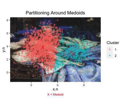
This time, we even obtain 2 clusters, centered around their own medoid (each marked with a X).
Mean Shift Clustering
This method places a weight (termed kernel) to each data point to built a probability distribution. The distribution will change depending on the bandwidth chosen to smooth the surface of the probability distribution.
The algorithm shifts the data points onto the closest peak of the probability distribution, until no point can be shifted any more.
The first step to apply this method is to reduce the points to the same scale, for example by their standard deviation.
library(MASS)

# scale data by sd
sd <- cbind(x.n=sd(dc.b$x.n), y.n=sd(dc.b$y.n))

sc.d <- dc.b/sd

#calculate kernel
z <- kde2d(sc.d$x.n, sc.d$y.n)

#plot kernel map
pic <- ggplot(sc.d, aes(x=x.n, y=y.n)) +
  annotation_custom(rasterGrob(image, width = unit(1,"npc"), height = unit(1,"npc")), -Inf, Inf, -Inf, Inf) +
  stat_density2d(aes(fill=..level..), geom="polygon",
                 alpha=0.5, h=c(0.3, 0.3)) +
  stat_density2d(aes(col=..level..), h=c(0.3, 0.3)) +
  scale_fill_gradient2(low="skyblue2", high="firebrick1",
                       midpoint=mean(range(z$z))) +
  scale_color_continuous(low="skyblue2", high="firebrick1") +
  coord_fixed() +
  labs(y="") +
  guides(color=FALSE)

points <- ggplot() +
  geom_point(data=sc.d, aes(x=x.n, y=y.n),
    shape=21, size=2, col="black",
    fill="gray", alpha=0.8, size=2) +
  stat_density2d(data=sc.d, aes(x=x.n, y=y.n, fill=..level..), geom="polygon",
                 alpha=0.5, h=c(0.3, 0.3)) +
  stat_density2d(data=sc.d, aes(x=x.n, y=y.n, col=..level..),
                 h=c(0.3, 0.3)) + #bandwidth
  scale_fill_gradient2(low="skyblue2", high="firebrick1",
                       midpoint=mean(range(z$z))) +
  scale_color_continuous(low="skyblue2", high="firebrick1") +
  coord_fixed() +
  labs(y="") +
  guides(color=FALSE)

library(patchwork)
combined <- pic / points & theme(legend.position = "bottom")
combined + plot_layout(guides = "collect") + plot_annotation(
  title = 'Multivariate kernel density estimation',
  subtitle = 'Scaling: SD; Bandwidth: 0.3')
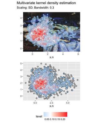
The plots show the level of density across the whole distribution. We can use the density distribution to cluster the data. The algorithm finds 3 clusters:
# install.packages("LPCM")
library(LPCM)
set.seed(88)
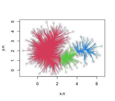
cl.ms <- ms(as.matrix(sc.d), scaled=0, h=0.3)
plot(cl.ms)
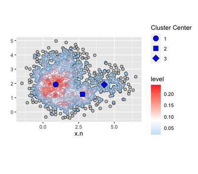
Centred around 3 coordinates in the density distribution:
knitr::kable(cl.ms$cluster.center)
| x | y |
|---|---|
| 0.8943363 | 1.927752 |
| 2.7723615 | 1.237859 |
| 4.2952553 | 1.918252 |
Since we are talking of density distribution, the cluster centers correspond to the modes, the most frequent values taken by x and y:
x <- cbind(cl.ms$cluster.center[,1])
rownames(x) <- NULL
y <- cbind(cl.ms$cluster.center[,2])
rownames(y) <- NULL
cc <- cbind(1:nrow(x))
coo <- as.data.frame(cbind(x,y,cc))
colnames(coo) <- c("x.n", "y.n", "cc")

modes <- points + geom_point(aes(x=x.n,
                                 y=y.n,
                                 shape=as.factor(cc)),
                             data=coo,
                             fill="blue", size=4) +
  labs(col="Shift Cluster") +
  scale_shape_manual(values = c(21,22,23,24)) +
  labs(shape="Cluster Center")
modes
sc.d$shift.cluster <- cl.ms$cluster.label
sc.d.1 <- subset(sc.d, shift.cluster==1)
sc.d.2 <- subset(sc.d, shift.cluster==2)
sc.d.3 <- subset(sc.d, shift.cluster==3)
sc.d.4 <- subset(sc.d, shift.cluster==4)
# sc.d.5 <- subset(sc.d, shift.cluster==5)
# sc.d.6 <- subset(sc.d, shift.cluster==6)
# sc.d.7 <- subset(sc.d, shift.cluster==7)

library(ggalt)
cl <- ggplot(data=sc.d, aes(x=x.n, y=y.n)) +
  labs(y="") +
  annotation_custom(rasterGrob(image, width = unit(1,"npc"),
                               height = unit(1,"npc")), -Inf, Inf,
                    -Inf, Inf) +
  geom_point(shape=3) +
  coord_fixed() +
  labs(shape="Cluster Center") +
  geom_point(aes(x=x.n, y=y.n, shape=as.factor(cc)),
             fill="blue", data=coo, size=4) +
  scale_shape_manual(values = c(21,22,23,24)) +
  theme(legend.position = "bottom") +
  geom_encircle(data = sc.d.1, col="red", linetype="solid") +
  geom_encircle(data = sc.d.2, col="red", linetype="longdash") +
  geom_encircle(data = sc.d.3, col="red", linetype="dotdash") +
  labs(title = "Mean Shift Clustering",
       subtitle = "Scaling: SD; Bandwidth: 0.3")

combined2 <- annotate_figure(cl,
               top = text_grob("Mean Shift Clustering"),
               bottom = text_grob("Scaling: SD \n Bandwidth: 0.3",
                                  hjust = 1),
               left = text_grob("y.n", rot = 90))
twop2
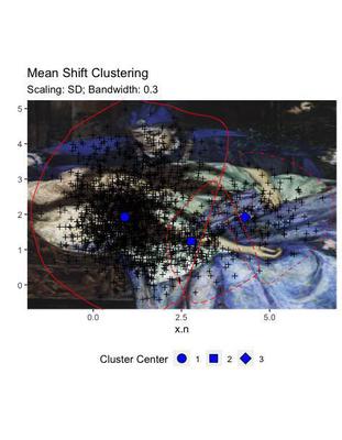
Differently from the other two solutions, this clustering does not display a sharp demarcation between the areas, but provides a certain degree of overlap. This mimics more efficiently the real situation of our data, where the areas of attraction of the artificial points did overlap.
Despite the fact that it seems more adept to the real data, this solution may be less generalisable, for example for application to external datasets. Being anatomically fitted on some data distribution, may reveal clusters that are not transferable.
Conclusions
The overall conclusions of this demonstrations are:
Cluster are not real! They are the best estimate based on algorithms that tend to minimise error, and do not necessarily overlap with subtending processes
When there is no information on the processes that may have lead to grouping in the data, hence the researcher does not possess an expectation in terms of how many clusters they may find, it is a good idea to compare different clustering methods
If you have a big enough dataset, save a test set to validate your cluster solution
Cluster solutions that fit the data like a glove are often down-weighted by increased variance that makes them less able to replicate on external datasets. This is often one of the main aims with eye-tracking studies - we want to find Areas of Interest that we can use across studies. So be careful!
Teresa Del Bianco
Postdoctoral Researcher
Scientist researching brain and child development and neurodiversity.